+43%
Purchase conversion uplift
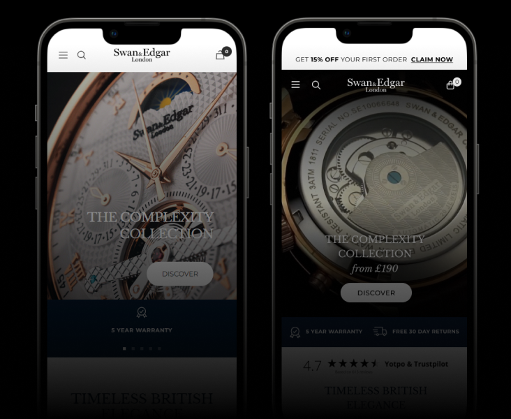
The Challenge
Swan & Edgar’s product detail pages had strong content but poor information hierarchy. Reviews were buried below the fold, coupon fields were hidden, and multi-buy promotions weren’t reaching the users they were designed for.
Heatmap analysis showed users were scrolling past key conversion triggers without engaging.
Our Approach
Rather than a full redesign, we made targeted UX adjustments based on behavioural data:
Key changes:
- Moved the reviews module higher on the PDP, placing social proof closer to the buying decision
- Elevated coupon field prominence — users couldn’t find the discount entry point
- Improved multi-buy promotional messaging with clearer value framing
- Better visual hierarchy to guide the eye toward conversion elements
The Results
- +43% uplift in purchase conversion rate — a significant increase from relatively small, data-informed changes
- The insight was clear: users wanted to buy, they just couldn’t find the reasons to
Sometimes the biggest wins come from the smallest changes. The content was already there — we just made sure users could see it.

Get similar results.
Start with a free audit — we'll show you exactly where the opportunities are and what they're worth.