+17%
Form engagement increase
The Challenge
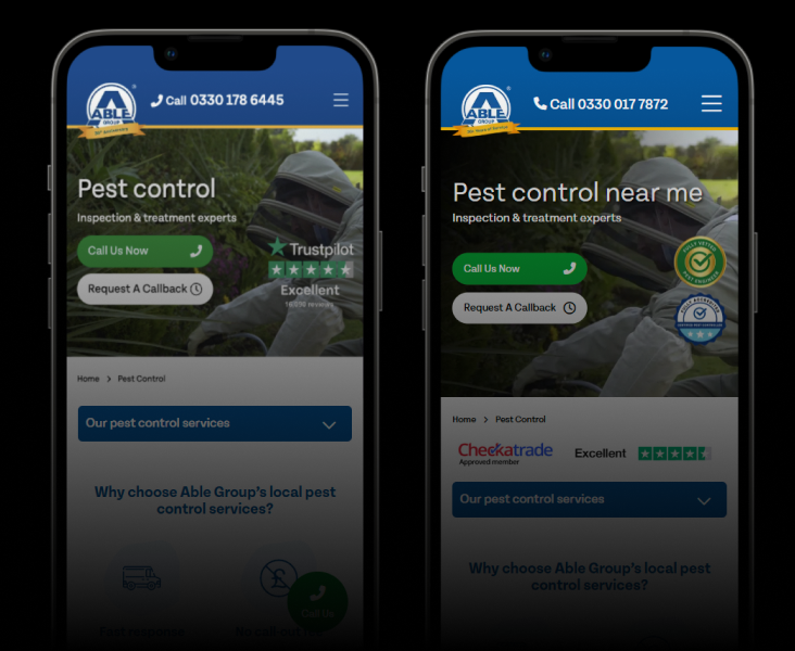
Mobile users were dropping off before reaching forms. The navigation was text-heavy and didn’t translate well to smaller screens, creating friction in the journey from landing to conversion.
Our Approach
We simplified the mobile navigation using icon-led layouts and restructured the site hierarchy based on click tracking data.
Key changes:
- Icon-led navigation replacing text-heavy menus on mobile
- Restructured site hierarchy based on actual user click patterns
- Reduced steps between landing and form engagement
The Results
- +17% increase in form engagement and application starts
- Reduced time-to-goal across mobile sessions
- Icon-led navigation now the standard across all Compare Fuel Cards mobile experiences

Get similar results.
Start with a free audit — we'll show you exactly where the opportunities are and what they're worth.