
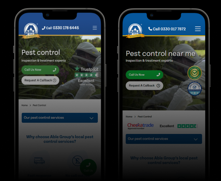
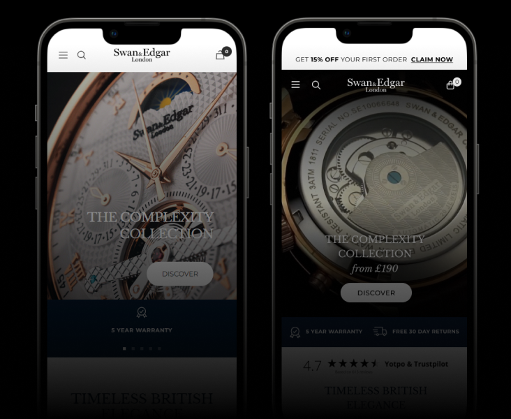
The Challenge
Allstar’s landing pages were cluttered with competing information, distracting users from the primary conversion goals. Information overload was causing decision paralysis, with too many elements fighting for attention across the page.
The existing design presented everything at once — pricing tables, feature lists, testimonials, and multiple CTAs — all competing for the same visual space. Users couldn’t easily identify the next step.
Our Approach
We stripped the pages back to their core purpose: converting visitors into enquiries. Every element was evaluated against one question — does this help or hinder the conversion?
Key changes:
- Simplified layout with clear visual hierarchy
- Prioritised key messaging above the fold
- Removed competing CTAs — one primary action per viewport
- Restructured content flow to match the user’s decision journey
- Improved form visibility and reduced perceived effort
The Results
The simplified approach delivered immediate, measurable impact:
- +70% increase in enquiries — more users reaching and completing the contact forms
- +63% increase in online applications — the streamlined journey removed friction at every stage
The data was clear: less really is more. By removing noise and focusing every element on the conversion goal, we transformed the same traffic into significantly more leads.
Related case studies.
Get similar results.
Start with a free audit — we'll show you exactly where the opportunities are and what they're worth.